/opportunity-mapper
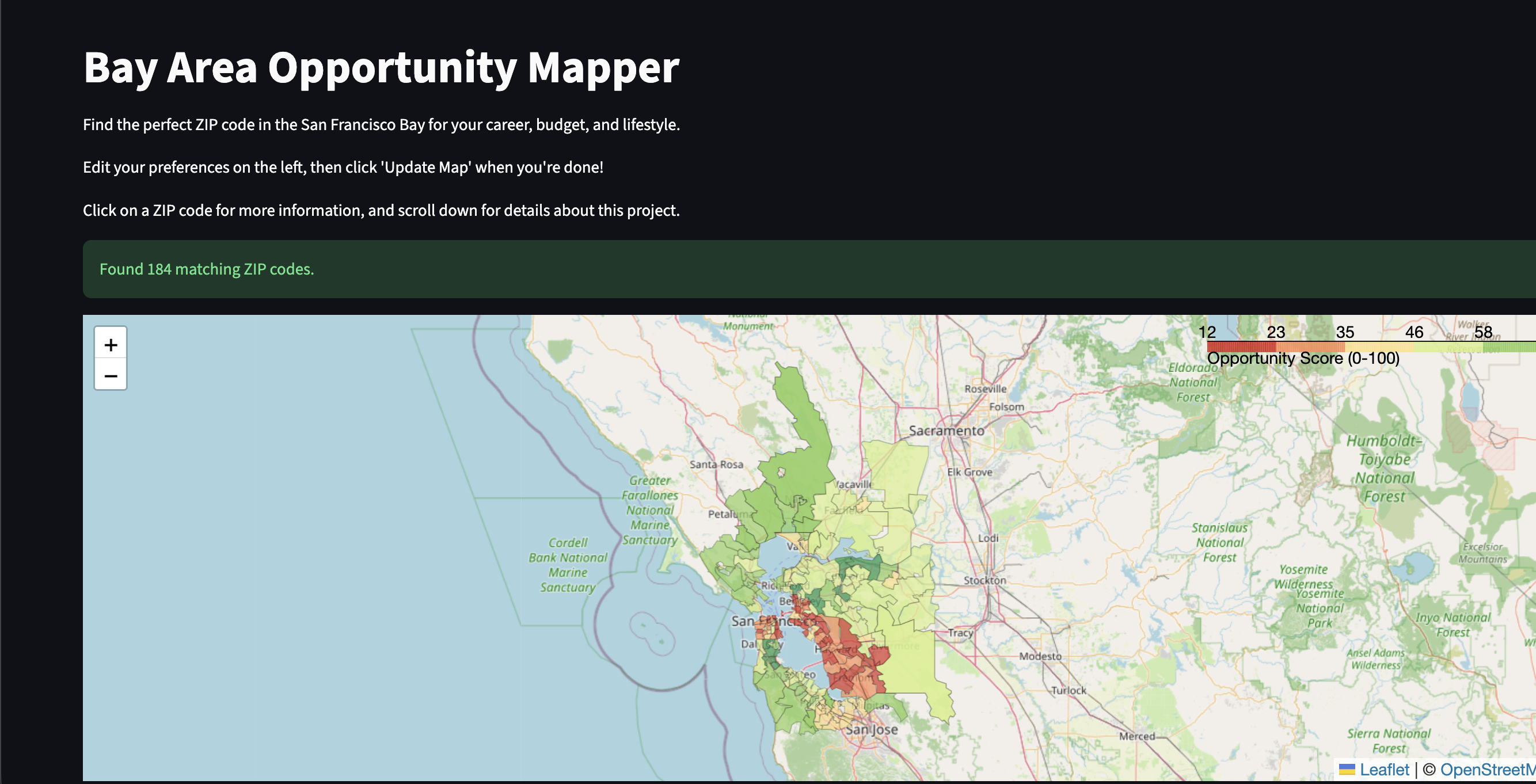
Click the image above to visit the live project
As anyone renting in the Bay can probably tell you, finding a place to rent can get tedious at best and Sisyphean at worst. Standard apartment finders were helpful for basic searches, but they all suffered from a major limitation: they only looked at rent. I wanted a way to evaluate neighborhoods holistically, factoring in safety, connectivity, and the economic vibrancy of the area. That led me to to build a demo version of that vision: the Bay Area Opportunity Mapper.
The goal was to create an interactive web application that synthesizes disparate datasets — HUD rent data, DOJ crime stats, transit access, and Census demographics — into a single, unified "Opportunity Score" for every ZIP code in the Bay Area.
1. The Architecture at a Glance
A primary engineering challenge for this platform was effectively integrating and normalizing completely disconnected geographic datasets. I avoided relying on expensive real-time API calls for this MVP and instead built robust, offline data pipelines using Jupyter Notebooks to clean, merge, and process the data. The application logic is broken down into three main pipeline stages: base data cleanup, geospatial joining, and metric normalization. These stages feed a processed dataset to the Streamlit front-end. This architecture guarantees that the application remains extremely fast when the user interacts with the heatmap or makes custom changes to what they prioritize in a place to live.
2. Engine Design: The Math Behind the Evaluation
To make the map dynamic and personalized to each user's priorities, the scoring engine needed to generate rankings based on flexible parameters, not static ratings. The backend processing handles the core engine logic:
- Data Integration: The engine merges HUD rent data, DOJ crime statistics, and Census demographics using geospatial joins with
GeoPandas. - Normalization: I used MinMax scaling from
scikit-learnto normalize all metrics on a 0 to 1 scale. This involved mathematically inverting "bad" metrics (like high crime rates and high rent) so that higher scores always represent better opportunities. - Dynamic Scoring Engine: A strict Weighted Decision Matrix compares the normalized metrics. The engine calculates the score by multiplying each metric by a user-defined weight and dividing by the sum of all weights.
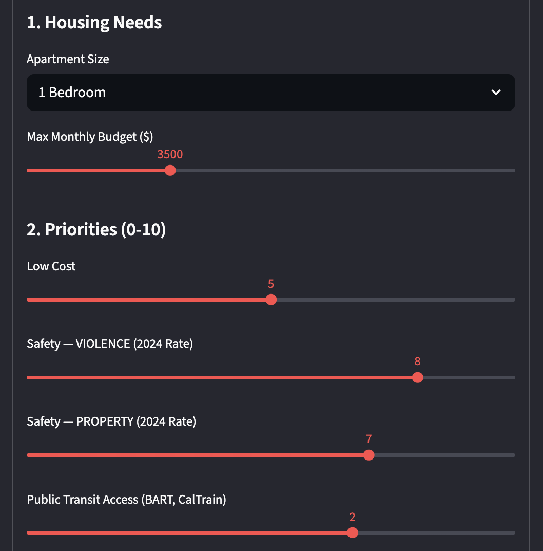
3. No-Friction Interactive UI
To ensure the tool was immediately useful, I built the front-end using Streamlit. Users can instantly start dragging sliders to adjust the weights of different metrics (e.g., optimizing for "Safety" versus "Budget"). When a user updates a slider, the Weighted Decision Matrix instantly recalculates the Opportunity Score for every ZIP code and triggers a re-render of the map. This provides immediate, intuitive feedback without any loading screens or page refreshes.
4. Visual Identity and Mapping
The frontend design philosophy centered around clarity and data density. Using Folium, I generated a dynamic choropleth map that visually represents the Opportunity Score across the Bay Area.
The interface is clean and analytical, allowing the geographical heatmap to take center stage. Users can hover over specific ZIP codes to see detailed breakdowns of rent, crime, transit access, and income, making the complex data easily digestible.
5. Data Pipelines and Processing
With a data-heavy application, keeping the frontend performant is critical. I utilized a multi-stage Jupyter Notebook pipeline to handle the heavy lifting offline:
- Base Cleanup (
BaseDatasets1.ipynb): Standardizes formats and drops irrelevant ZIP codes. Government datasets have NO shortage of those. - Geospatial Merging (
GeoDatasets1.ipynb): Connects the raw data to physical boundaries and shapefiles. - Metric Calculation (
Metrics1.ipynb): Handles the MinMax scaling and prepares the final display columns. This ensures that the deployed Streamlit app only interacts with a highly optimizedfinal_df_with_norms.csv, allowing it to run efficiently on limited cloud resources.
Conclusion
As a demo, I believe this project has great potential. It was a fun 2-week exploration into geospatial data engineering and interactive visualizations, and with access to Zillow API keys and more granular crime data, there's plenty of more information to unlock for users. One teaching moment was figuring out how to successfully perform geospatial joins across datasets that didn't share perfectly matching ZIP code or county identifiers, requiring creative use of Census crosswalk files.
Next steps would include transitioning from static government CSV files to live APIs (like Zillow or Transit APIs) for real-time accuracy, as well as expanding the map beyond the Bay. These incremental improvements will make the model even more comprehensive.
Sources
These were the sources used to obtain the data used in this project.
| Source | Link |
|---|---|
| Median Rent | huduser.gov |
| GeoSpatial Zip Codes | geodata |
| BART | bart.gov |
| CalTrain | arcgis |
| Median Income | census.gov (S1901) |
| Crime Statistics | OpenJustice DOJ |
| Zip Code/County/City Crosswalk | Census |